Designing a good matrimonial app starts with understanding what users really want. They want trust, clarity, and a smooth experience.
This guide shares practical and proven UI/UX tips to help you build an app that feels simple, safe, and easy to use.]
In the middle of everything, matrimonial app design focuses on clean layouts, clear steps, and features that help people connect with confidence.
From onboarding to profile screens and match discovery, every part of the design should support real user needs.
With the right approach, you can create a meaningful and reliable platform for modern matchmaking.
The global online matrimony market is growing every year as more people turn to digital platforms to find a life partner.
This growth is driven by rising internet use, better mobile access, and changing social habits across the world.
In the matrimonial app design guide, it’s important to understand how big this market is because a good UI/UX can help users feel safe, confident, and comfortable while using these platforms.
The global online matrimony market is valued at around $6 billion in 2025.
It is expected to reach over USD 13 billion by 2033, showing strong long-term growth.
The combined online dating and matchmaking industry has crossed USD 9 billion in 2025.
Asia-Pacific is one of the fastest-growing regions for online matchmaking apps.
Better smartphone access and digital awareness are pushing more people worldwide to use matrimonial platforms.
A well-designed matrimonial app can make the match-finding journey easier, smoother, and more trustworthy for users. That’s why UI/UX plays a major role in how people feel and interact with the platform.
A clear and simple interface helps new users feel confident when they join a matrimonial platform. Many people take help from a matrimonial app development company to build one that looks trustworthy and easy to follow. A good first impression encourages users to explore the app further.
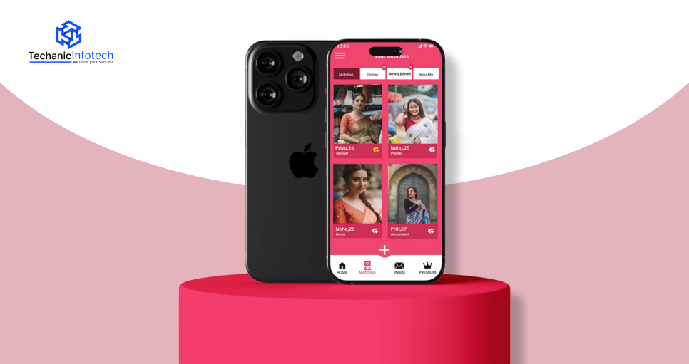
A good matrimonial app design makes it easy for users to find suitable matches. Clear sections, useful filters, and a simple search flow help users move from one profile to another without confusion. This smooth experience keeps users active and happy.
A well-planned layout ensures users can complete every step easily-from creating their profile to the journey feels simple and natural, people stay longer and explore more options.
Strong UI/UX tips for a matrimonial app include adding clear buttons, easy options, match suggestions, and elements that keep users engaged and make the app more enjoyable to use.
Matrimonial apps handle sensitive personal information. Good UI/UX design ensures users can easily access privacy settings, verification badges, and safety alerts.
This builds trust and encourages users to interact with confidence, and it also highlights how important the matrimonial App Design Process is in creating a safe and user-friendly platform.
When users find relevant matches quickly and enjoy the app experience, they return more often. A smooth design reduces frustration and raises the chances of meaningful connections, helping the platform grow steadily.
Designing a good matrimonial app starts with understanding how users think, what they expect, and how they want to connect with potential matches.
People look for an app that feels simple, secure, and comfortable to use. This is why strong UI/UX decisions are important from the beginning.
Whether someone is exploring matrimonial app Ideas or improving an existing product, these five core components build the base of a smooth and trustworthy user experience.
Navigation is one of the first things users notice.
When designing a matrimonial App, users should immediately know where to find matches, view profiles, or check messages without searching through too many buttons.
A clear bottom menu with easy icons works well for most users. Predictable navigation builds confidence because people can move around the app without confusion.
When navigation feels smooth, users spend more time connecting with others rather than trying to understand how the app works.
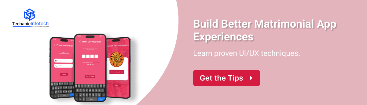
Onboarding is where users create their profiles, and it must be simple and helpful.
Asking too many questions at once can feel stressful, so breaking the process into small steps works better.]
Basic information, photos, and personal preferences can be added one section at a time. Progress indicators also help users understand how much is left.
A good onboarding flow improves profile completion and makes the app feel welcoming from the start.
This is an important step when deciding how to design a matrimonial app that users enjoy from their first interaction.
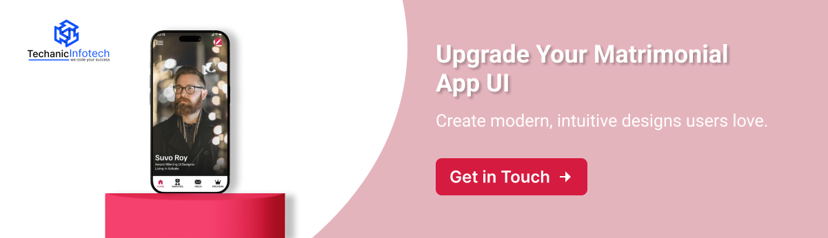
A profile is where users learn about each other, so the layout should be clean and easy to read.
Important details like age, location, profession, and family background should be placed at the top.
Photos should be clear and well-framed, and action buttons like “send interest” or “chat” should be easy to spot.
A simple layout helps users make quick decisions without feeling overloaded.
The goal is to create a page where everything is easy to find and understand, leading to better matches and smoother interactions.
Search and filters are key features in a matrimonial app because users want to find the right match based on their preferences.
Filters like age, location, education, and interests should be easy to adjust. Grouping filters into simple categories makes the experience even smoother.
Sliders, checkboxes, and dropdowns help users refine their search quickly without getting confused.
A good search and filter flow gives users more control and helps them reach accurate results faster. This leads to a more positive experience and keeps them engaged.
Trust is one of the biggest concerns in matrimonial platforms
UI elements like verification badges, privacy settings, and reporting options must be easy to notice and use.
Verification badges help users identify genuine profiles, while privacy controls allow them to choose who can see their details.
Even simple touches like showing when a profile is verified can make users feel more secure.
When safety features are easy to understand, people feel more comfortable interacting with the app.
This builds long-term trust and encourages users to spend more time exploring potential matches.
Designing a matrimonial app takes planning, user understanding, and a smooth UI/UX approach. People join matrimonial platforms with hope, trust, and expectations.
A well-designed app guides them step by step from sign-up to finding the right match. This guide to designing a matrimonial app explains each stage in simple language so it’s easy to understand and follow.
The first step is learning what different users want from a matrimonial platform.
Some want fast search results, while others prefer detailed profiles. Many users also focus heavily on privacy and safety.
To meet these expectations, designers must study user behavior through surveys and competitor analysis. Following the right tips for designing a matrimonial App helps create a product that truly matches user needs.
This understanding becomes the base for the entire design journey and ensures users feel comfortable from the moment they open the app.
Every matrimonial app must have a clear purpose.
Some apps focus on modern matchmaking, while others serve specific communities or regions. Defining the vision early helps shape the design tone.
It also sets the direction for matrimonial app design, making sure the app feels consistent across all pages.
When the goals are clear, it becomes easier to create a design that users can relate to and trust.
User personas help designers understand who will use the app. For example:
A working professional looking for long-term compatibility
A parent searching profiles for their child
A user who wants complete privacy and secure interactions
These personas guide the design team in building features and layouts that solve real user problems. With personas, designers can think like actual users and make choices that reflect their needs and expectations.
A user journey map shows how a user moves through the app from onboarding to sending interest.
Mapping this journey helps identify moments where users may feel confused or stuck.
Once the flow is clear, designers can build helpful prompts and smoother transitions.
This step also supports teams planning how to design a matrimonial app by showing each interaction in a clear sequence.
Information architecture decides how content is arranged.
Users should easily find matches, chats, filters, and profile settings. Grouping similar features helps reduce confusion.
Simple menus, clean categories, and minimal steps make the app feel organized.
This foundation ensures users can move smoothly without needing extra guidance or instructions.
Wireframes act as basic sketches of each screen.
They show where photos, buttons, forms, and filters will be placed.
Wireframes make it easy to test ideas before designing the final look. They also help the team identify unnecessary steps and remove them early.
A good wireframe focuses on clarity, simplicity, and flow rather than visual decoration. Once the wireframes look right, it becomes easier to move into high-quality design.
This step involves adding colors, typography, icons, and spacing.
Consistency across all screens helps users feel familiar with the app, even if they open a new section.
The design should match the app’s personality, whether modern, traditional, or balanced.
Clear buttons, readable text, and neat spacing make the interface comfortable to use. These visual decisions create emotional trust and make the overall experience smooth.
Users should easily move between home, matches, profile, chat, and settings.
A simple bottom navigation bar works well for most age groups.
Accessibility is equally important; text should be readable, buttons should be large enough to tap, and animations should not distract users.
This step also helps reduce confusion for older users or parents who may not be very familiar with apps. A smooth navigation system ensures the app feels welcoming to everyone.
Trust plays a major role in matrimonial platforms.
Verification badges, report options, privacy sections, and restricted access features must be clearly visible and easy to use.
Users should understand how their data is protected and who can view their details. Highlighting verification features also increases confidence.
Many users check safety options before interacting with others, so this part must be simple and transparent.
These design choices also help explain the matrimonial app development cost, as secure features require careful planning.
Testing is the final step before launching the app. Designers must observe how real users interact with the screens.
Testing shows which areas are easy and which require improvement. A/B testing helps compare different designs and choose what works best.
Feedback from users ensures the app stays updated and continues improving even after launch. Continuous updates keep the platform relevant and user-friendly.
Choosing the right matrimonial platform is not just about finding matches; it’s also about how easy and comfortable the app feels to use.
A clean interface, simple navigation, and quick onboarding play a major role in shaping a good user experience, which is why matrimonial App UI/UX design has become so important today.
Many US-based platforms are known for their smooth layouts and smart features, setting strong examples for new apps entering the market.
Below are the Top 5 US-based Matrimonial Apps that stand out for their user-friendly design, modern layout, and overall better experience.
Match.com is one of the most trusted platforms in the US. Its clean layout, easy navigation, and simple onboarding make it user-friendly.
The card-style profile browsing and guided matching improve user engagement. It also inspires many matrimonial app development choices because of its stable performance and smooth design flow.
eHarmony is well-known for its structured profile format and compatibility-based matching.
The app uses soft colors, clear typography, and a very organized interface. It is often studied as a benchmark for good matrimonial app design due to its seamless user journey.
EliteSingles focuses on serious relationships and uses a neat, professional UI style. The app offers easy profile setup, smart filters, and a clean dashboard.
Many businesses follow its layout when planning features in a matrimonial app, especially for premium matchmaking concepts.
Zoosk offers a modern dating-meets-matrimony experience with an interactive design.
Its swipe-friendly interface, smooth animations, and smart suggestions make browsing simple. The app keeps the user experience light, quick, and visually appealing.
This app has a simple, faith-focused design with clear profile displays and straightforward search options.
Its UI is built around easy filtering and meaningful connections. It is user-friendly and follows a clean design pattern that many new platforms try to replicate.
A good matrimonial app design helps users feel comfortable, confident, and safe while searching for the right match. When the app looks simple, works smoothly, and is easy to understand, users naturally enjoy the experience more. Below are the main advantages of focusing on UI/UX for any matrimonial platform.
A strong onboarding flow helps users sign up, add basic details, and complete their profiles without confusion. In matrimonial app design, this is one of the most effective UI/UX Tips for Matrimonial App success.
A simple start encourages users to continue exploring the platform and increases the chance of profile completion.
Clear buttons, clean menus, and well-structured screens make it easy for users to move around the app. When navigation is simple, people can find matches, check profiles, and communicate without stress or effort. This improves their overall comfort inside the app.
Good UI/UX ensures that users see profiles that match their preferences. Filters, search tools, and match suggestions become easier to use. This helps users feel satisfied with the options they receive, leading to better compatibility and smoother match-finding.
Soft colors, proper spacing, readable text, and well-arranged sections create a friendly look. A pleasant design keeps users engaged for longer. This also builds trust because people feel the platform is reliable and safe.
Clear chat features, easy-to-use contact options, and simple privacy settings help users communicate without fear. A well-built flow, as suggested in any good Matrimonial App Design Guide, increases user confidence and makes conversations smooth and secure.
A clear and well-planned matrimonial app design helps you estimate the real budget by breaking down every stage of the process, making it easier to understand where your money goes and what features you truly need.
|
Cost Component |
Estimated Cost Range (USD) |
What It Covers |
|
Planing & Research |
$1,000 – $5,000 |
Requirements analysis, competitor research, user personas, and defining the vision. |
|
UI/UX Design |
$1,000 – $15,000 |
Wireframes, mockups, visual design, prototyping, and usability testing. |
|
Frontend Development (iOS & Android) |
$10,000 – $60,000 |
Building the mobile app UI, interactions, and screens. Depends on platform (native/cross-platform). |
|
Backend Development & Infrastructure |
$5,000 – $50,000 |
Servers, databases, APIs, real-time match algorithms, and cloud setup. |
|
AI/Matching Algorithm (optional) |
$5,000 – $45,000+ |
Smart match logic, machine learning, recommendation engine, NLP. |
|
Chat & Communication Features |
$1,000 – $20,000 |
Real-time messaging, push notifications, audio/video calling. |
|
Testing & Quality Assurance (QA) |
$1,000 – $15,000 |
Functional testing, usability testing, performance, bug fixes. |
|
Deployment & Launch |
$1,000 – $5,000 |
Launching to app stores, setup up release builds, and initial server deployment. |
|
Maintenance & Updates (Annual) |
~ 15–25% of Initial Cost / Year |
Bug fixes, OS updates, feature enhancements, and server costs. |
Techanic Infotech is a trusted matrimonial app development company known for creating simple, smart, and scalable app designs that help users find matches comfortably.
The process starts with understanding what users need: easy signup, smooth navigation, and a clean interface that works for all age groups.
Based on this, the team creates a design that is simple to use, visually clear, and supports a smooth journey from registration to match discovery.
The designers at Techanic Infotech focus on clean layouts, readable text, and well-placed buttons so that users never feel confused or stuck.
Their approach to matrimonial app design ensures the app looks modern while still being comfortable for people who may not be very tech-savvy. Every feature is placed in a way that feels natural and easy to follow.
Scalability is another priority. The team builds designs that can handle thousands of profiles, chat features, and filters without slowing down.
They also pay attention to safety by adding secure login options, profile verification, and privacy controls.
With smart planning, strong design choices, and regular testing, Techanic Infotech delivers matrimonial apps that are easy to use, fast to load, and ready to grow with the platform’s future needs.
Creating a successful matrimonial platform depends on how easy, safe, and comfortable the experience feels for users, and this is where a strong matrimonial app design makes a big difference.
When the design is simple, the app becomes easy for everyone to use, including people who are not very familiar with technology.
A clean flow, clear buttons, and well-planned screens help users move from one step to another without confusion. This builds trust and encourages them to stay active on the platform.
Good design is also important for long-term growth.
This requires thoughtful planning in both design and structure. Adding features like profile verification, easy filters, and simple chat options further improves the overall experience.
A good design is simple, easy to use, fast, and clear. It helps users find matches and communicate without confusion.
The design cost usually depends on features, complexity, and screen count. On average, it can range from $5,000 to $15,000.
Good UI/UX builds trust, improves user satisfaction, and makes matchmaking easier by guiding users smoothly through the app.
It typically takes 4–8 weeks, depending on the number of screens, features, and revisions needed.
Yes. Custom design tailored to the target audience increases comfort, trust, and the amount of time users spend on the app.

Neha Sharma is a tech expert at heart who loves exploring new technologies and turning complex ideas into easy-to-understand content. With a passion for learning and writing, she enjoys sharing insights on emerging tech, digital products, and innovation that help businesses stay ahead.