Mobile App Development
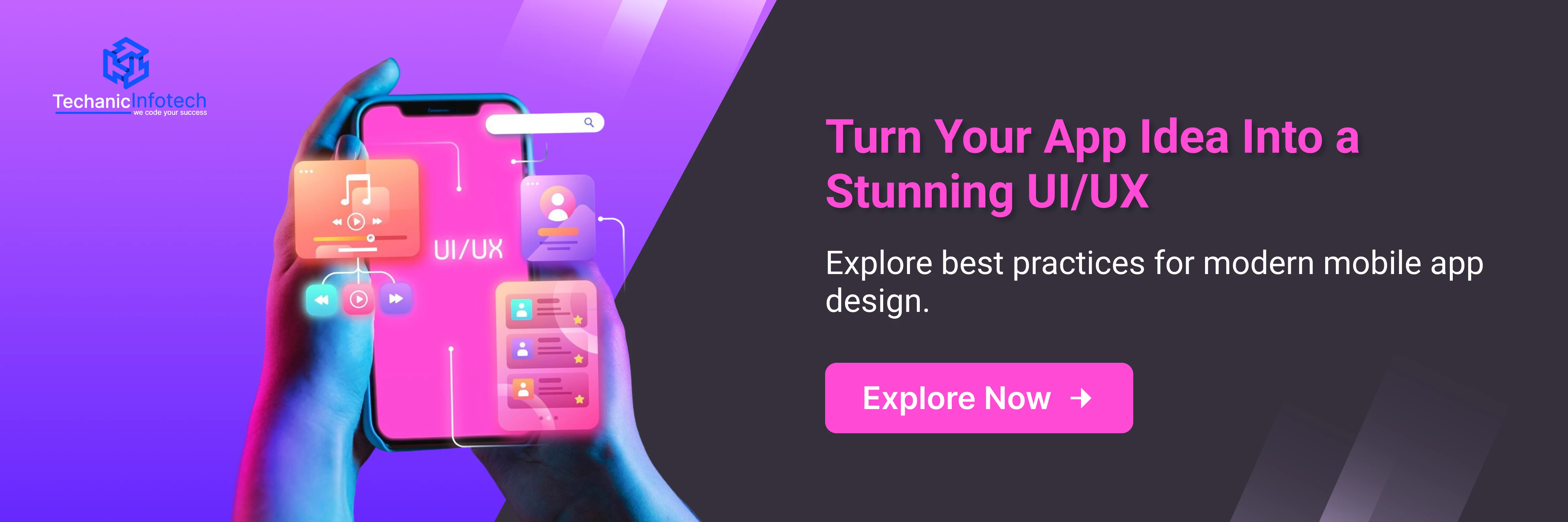
The Complete Mobile App Design Guide: Build User-Friendly Apps That Stand Out
December 9, 2025
December 9, 2025
Designing a mobile app today is much more than choosing colors and arranging screens. Users expect smooth navigation, fast performance, and interfaces that feel natural from the very first tap. That’s why having a clear mobile app design guide is essential for anyone planning to create a modern digital product.
If you are exploring mobile app UI/UX design, searching for app design ideas, or learning how to design an app from scratch, understanding the right steps makes all the difference. A well-structured design process helps you build apps that not only look beautiful but also solve real problems and keep users engaged.
In this complete guide, we’ll break down the core principles, steps, and best practices of designing mobile apps, so you can confidently plan and create an app that users love.
Mobile app design plays a major role in how users experience your product. A well-structured mobile app design guide helps you build apps that are easy to use, visually appealing, and aligned with modern user expectations.
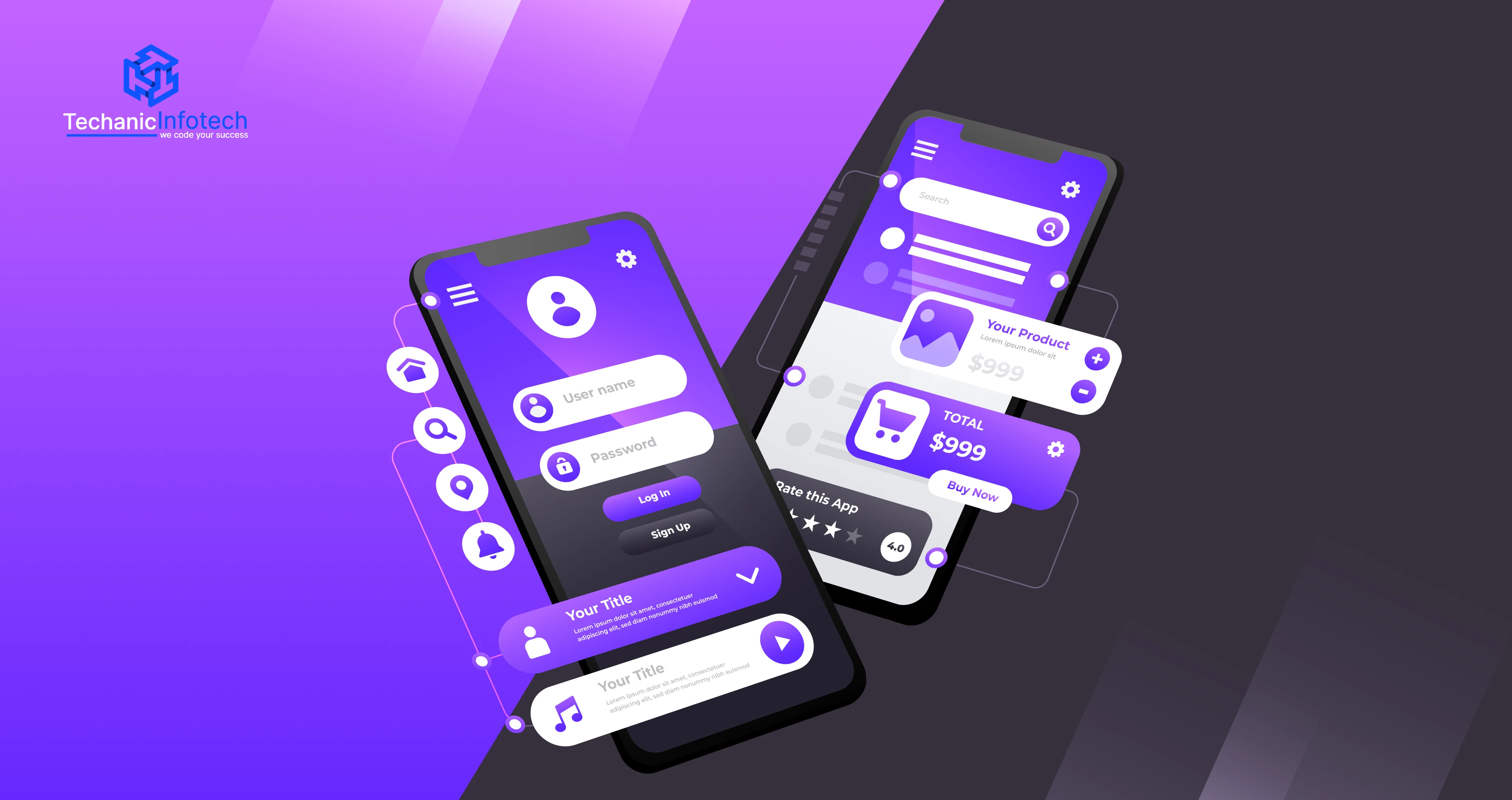
Mobile app design is the process of creating the look, feel, and overall experience of a mobile application. It combines visual design (UI) and user experience design (UX) to make sure every part of the app is easy to use, intuitive, and enjoyable.
A well-designed app guides users naturally, helping them complete tasks without confusion, frustration, or unnecessary steps.
Mobile app design typically begins with understanding user needs, planning smooth navigation, and sketching out how screens connect. Designers then choose colors, typography, icons, spacing, and layout elements that reflect the app’s purpose and brand identity.
Prototyping and frequent testing are also essential parts of the design process to ensure that real users can understand and use the app effortlessly.
In simple terms, mobile app design is about creating apps that don’t just “work” but feel right. If it’s an education app, a fitness app, or an on-demand service platform, the goal is the same: make the experience simple, attractive, and meaningful.
A great design helps users trust the product, enjoy using it, and ultimately come back again, turning a basic app into something truly valuable.

A well-designed mobile app doesn’t just look good, it plays a major role in whether users stay, return, or leave permanently. Here’s why investing in great design is critical:
► First Impressions Decide Whether Users Stay or Leave
Most users decide within seconds whether an app feels worth their time. A clean layout, clear buttons, and a visually appealing interface can instantly create trust. A messy or confusing design, however, often results in immediate uninstalls.
► Smooth Navigation Reduces Friction
Good UX ensures users can easily find what they need. Clear menus, logical flows, and intuitive gestures help users move through the app without frustration. When navigation feels effortless, users naturally spend more time inside the app.
► Higher Engagement Means Higher Conversions
Engaging designs with thoughtful UI elements, like interactive cards, micro-animations, or personalized screens, encourage users to explore more features. The more users interact with the app, the more likely they are to convert, subscribe, or make purchases.
► Reduces Cognitive Load
Users don’t want to think too much while using an app. Strong UX simplifies tasks by breaking complex processes into easy steps, resulting in fewer drop-offs and better task completion rates.
► Builds Long-Term Trust
Consistent design, predictable behavior, and reliable feedback (like loading states or error messages) make users feel comfortable. Trust is crucial for industries like finance, healthcare, or education apps.
► Boosts Brand Recognition & Loyalty
Color patterns, icons, and UI styles help establish a memorable brand identity. When users recognize and feel connected to an app’s visual personality, retention naturally increases.
► Reduces Development Costs Later
A good design system and clear UI/UX planning minimizes rework and fixes during development. This saves time, reduces bugs, and keeps the project on track.
► Better Accessibility Means More Users
Accessible design ensures people with disabilities or limitations can use the app. This not only improves usability but also widens your audience reach
|
Category |
UI (User Interface) |
UX (User Experience) |
|
Definition |
The visual layer of the app that users interact with. |
The overall experience a user has while using the app. |
|
Primary Goal |
Make the app attractive, consistent, and visually engaging. |
Make the app easy, intuitive, and valuable to use. |
|
Focus Areas |
Colors, typography, icons, spacing, buttons, animations, layout. |
Navigation flow, usability, accessibility, functionality, user satisfaction. |
|
Core Question Answered |
How does the app look? |
How does the app work and feel? |
|
Main Deliverables |
Style guides, design systems, screen mockups, visual prototypes. |
User flows, wireframes, journey maps, interaction prototypes. |
|
Tools Used |
Figma, Adobe XD, Sketch, Illustrator, Procreate. |
Figma, Miro, Whimsical, Balsamiq, Hotjar, Maze. |
|
Skill Set Required |
Visual design, color theory, layout design, typography, aesthetic sense. |
Research, psychology, problem-solving, testing, flow mapping, behavior analysis. |
|
Impact on Users |
Creates emotional appeal and first impressions. |
Determines how quickly and comfortably users complete tasks. |
|
Success Metric |
Users find the interface visually pleasing. |
Users achieve goals easily with minimal friction. |
|
Typical Mistakes |
Over-designing, inconsistent styles, unclear buttons. |
Complex workflows, too many steps, confusing navigation. |
|
Examples in Real Apps |
Instagram’s clean layout, Spotify’s color theme, Uber’s buttons. |
Amazon’s easy checkout flow, Duolingo’s guided learning, Google Maps’ intuitive navigation. |
|
Who Benefits Most? |
Users who value aesthetics, branding consistency, and visual appeal. |
All users, especially those who seek speed, clarity, and ease of use. |
|
End Result |
A beautiful, polished interface. |
A smooth, satisfying overall app journey. |
Before you start creating screens, choosing colors, or planning layouts, the most important step in any mobile app design guide is understanding who will use your app and what they expect from it.
When you truly understand your users, designing and developing a mobile app becomes easier, faster, and far more effective. User-centered design not only improves usability but also increases retention, conversions, and overall satisfaction.
This section will help you learn how to analyze user behavior, create realistic personas, and map their journeys so you can build a product that feels natural to them.
Every user opens an app with a specific intention. Some want to learn, some want entertainment, and others simply want to complete a task quickly. Before you move deeper into the steps of designing an app, you must understand three core things:
► User Behavior
This refers to how users interact with an app, how long they stay, where they tap, what they avoid, and what frustrates them. Studying user behavior helps you design screens that match real usage patterns. For example:
Users prefer minimal steps for completing a task
They tap the screen mostly in the center and bottom area
They value quick loading and simple navigation
This insight is crucial for effective mobile app UI/UX design.
► User Goals
What does your user want to accomplish?A student wants quick access to lessons, a shopper wants easy checkout, and a fitness user wants fast tracking.Clear goals help you arrange features in the correct order and remove anything unnecessary.
► User Expectations
Modern users expect apps to be fast, intuitive, and predictable. They don’t want to search for buttons or read long instructions. The best app design ideas come from meeting these expectations:
Clear icons
Simple language
Smooth onboarding
Thumb-friendly layouts
When your app meets user expectations, it naturally becomes more enjoyable and easier to use.
A user persona is a fictional profile that represents your ideal user. Personas are a vital part of the mobile app design process because they help you design with clarity instead of guessing.
Each persona usually includes:
Name and demographic background
Goals and motivations
Challenges and frustrations
Preferred features
Device type and tech comfort
Personas help designers understand what users need and how they think. This ensures that every screen, button, and flow adds real value. Personas also guide the tone, color, content style, and layout of your app.
Once you understand who your users are, the next step is mapping how they will use the app. This is where user journeys and flowcharts help.
► User Journey
A user journey shows each step a user takes from opening the app to achieving a goal. For example:Open app – Sign up – Choose preferences – Start using main features – Complete task
This helps you identify which steps can be simplified or improved.
► Flowcharts
Flowcharts visually outline how each screen connects to the next. They ensure smooth transitions and minimize confusion. A well-planned flowchart is one of the core elements in the design of an app, especially for complex platforms like eCommerce, fitness, or education apps.
Flowcharts also help developers understand your design logic, reducing rework later.
By understanding user behavior, creating clear personas, and mapping user journeys, you build a strong foundation for your app. These steps make every part of mobile app interface design more meaningful, ensuring your final product feels natural, intuitive, and enjoyable.
Designing a successful mobile app goes far beyond choosing colors and icons. A great design feels natural, guides users smoothly, and helps them achieve what they want without confusion.
In every mobile app design guide, the foundation of good design is built on a few essential principles. These principles help ensure your app is easy to use, visually appealing, and aligned with modern user expectations.
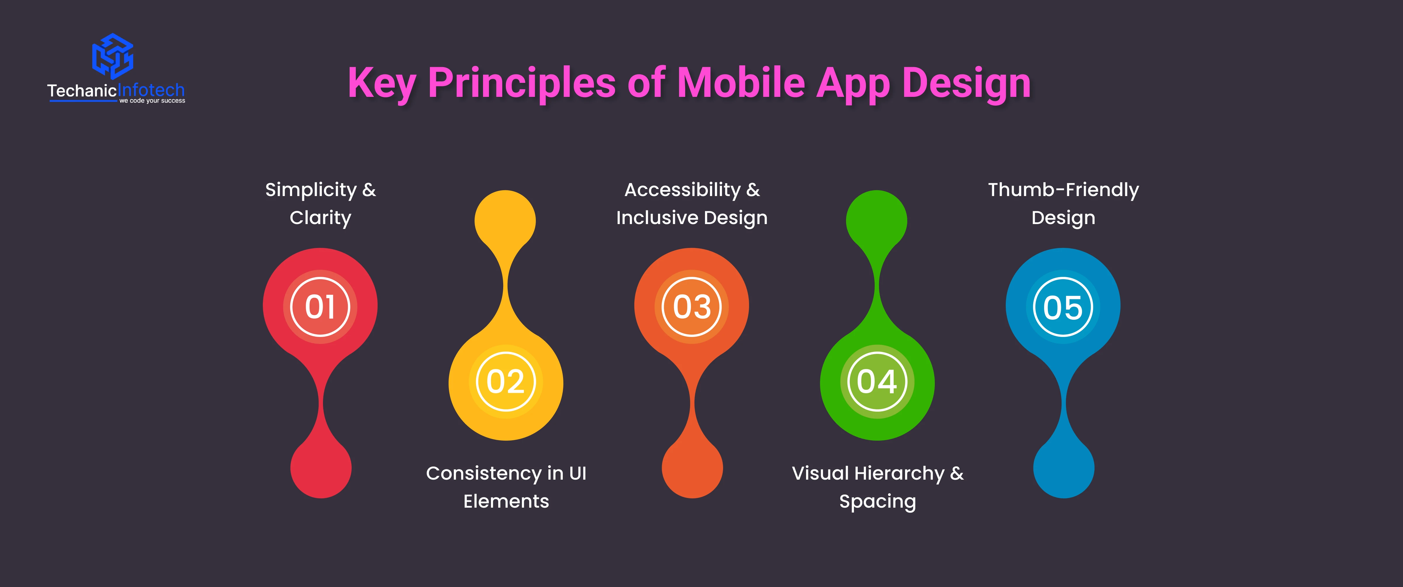
Below, we break down the most important principles for designing mobile apps and building an experience users will love.
Simplicity is the heart of great mobile app UI/UX design. Users don’t want to think too hard about how to use your app, they want instant clarity. Keeping screens clean, reducing unnecessary elements, and using familiar icons make your interface easy to understand.
Clarity also means avoiding long text, confusing labels, or too many features at once. A simple design helps users focus on what actually matters and makes the overall experience stress-free and enjoyable. The goal is to guide users, not overwhelm them.
Consistency builds trust. When your app design uses the same colors, button styles, icons, and patterns across all screens, the user experience becomes predictable. Predictability is important in designing mobile apps because it makes the app feel reliable and professional.
Consistent layouts also reduce the learning curve. Users immediately know where to find key features, how navigation works, and what to expect next. This is why consistency is a key highlight in every mobile app design guide and professional workflow.
A good app is usable by everyone, including people with disabilities. Accessibility means designing your app so users with visual, hearing, or mobility challenges can comfortably use it.
This includes:
Clear font sizes
Good color contrast
Voice-over compatibility
Easy-to-reach buttons
Making your app inclusive not only expands your audience but also shows that you care about every user. Accessibility is now an essential part of mobile app interface design, not an optional feature.
Visual hierarchy guides the user’s eye. It helps users instantly understand what is important and what action they should take. Designers create hierarchy through font sizes, colors, spacing, and placement.
Good spacing makes your app feel clean, organized, and easy to scan. Poor spacing creates confusion and makes even simple tasks feel complicated. When designing a mobile app, proper spacing helps your content “breathe” and improves readability.
Most users operate their phones with one hand. This makes thumb-friendly layouts essential in modern mobile app UI design. Buttons, menus, and core actions should be placed within the thumb’s natural reach, especially on large screens.
This improves comfort, speed, and overall usability. A thumb-friendly app feels effortless, which significantly boosts user satisfaction and retention.
Designing a mobile app is not just about picking colors or sketching a few screens. It’s a structured journey where every step ensures that the final product is usable, beautiful, and meaningful for users.
A well-defined process helps you avoid confusion, reduce rework, and build an app that people actually enjoy. In this mobile app design guide, we’ll walk you through the complete step-by-step process of designing a mobile app, from the first idea to a polished user interface ready for development.
If you are a business owner, designer, or developer, understanding these steps makes the design of an app smoother and more strategic.
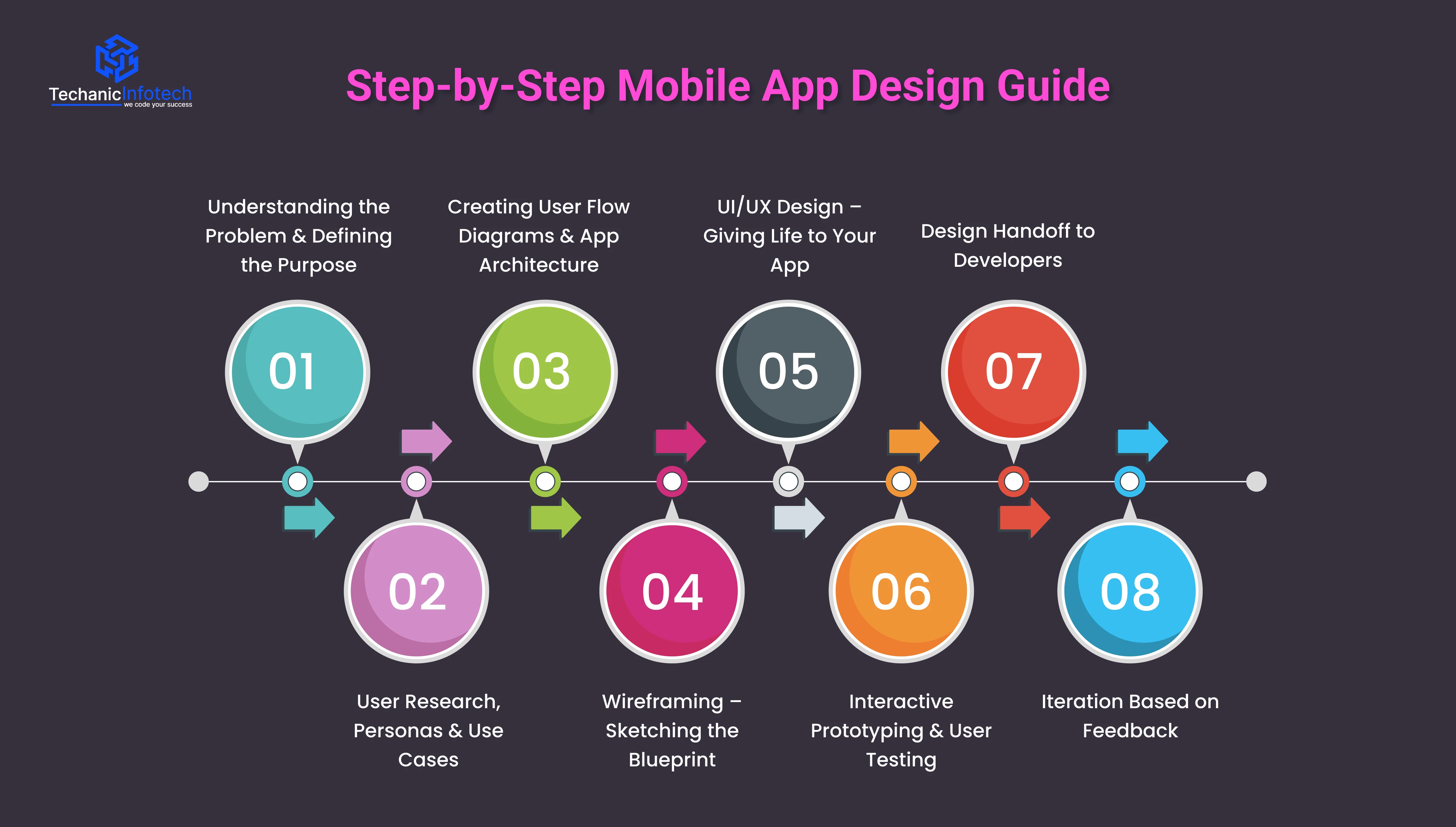
Every great app starts with understanding “why it needs to exist.” Before opening any design tool, you must get clarity about the problem your app will solve and who will use it.
This step includes:
Identifying the app’s core purpose
Understanding user pain points
Studying how competitors solve the same problem
Listing must-have features
This is the stage where you define the foundation for designing mobile apps. Without a clear purpose, even the best UI may fall short because users won’t find real value. This step sets the direction for the entire mobile app UI/UX design process.
The next step is understanding your users deeply. This involves researching their behaviors, demographic details, goals, frustrations, and expectations. Every decision you make in the design later should be based on user research, not assumptions.
Here’s what you do in this stage:
User research: Interviews, surveys, competitor app analysis
User personas: Fictional profiles that represent your target users
Use cases & scenarios: When, why, and how users will use your app
This part of the mobile app design process ensures your app feels like it was made exactly for the user. When you understand your users well, the final design becomes intuitive and natural.
Once you know who your users are and what they want, the next step is to map out how they will move inside your app. This is one of the most important steps of designing an app because it defines the app’s structure.
User flows show pathways like:
How users sign up
How they complete their first task
How they move between pages
How they achieve goals (booking, purchasing, tracking, etc.)
This step makes the design logical and prevents unnecessary screens. It also helps teams visualize the entire app before starting the UI work. In any mobile app design guide, this stage is crucial because it sets the skeleton of the entire app.
Wireframes are simple, low-fidelity sketches that show the layout of the app without colors or images. Think of them as the blueprint of a building, they show structure, placement, and function.
Wireframes help you decide:
Where each element should be placed
What the user sees first on a screen
How navigation flows
Which actions stand out
This step is essential in designing a mobile app because it helps identify early problems before investing time in high-fidelity design. Wireframes are quick to edit and perfect for discussing ideas with your team or clients.
Once wireframes are approved, designers start creating the actual visual design. This includes colors, fonts, images, icons, spacing, and animations.
This stage transforms ideas into a beautiful, engaging, and interactive design.
Key elements include:
Creating the visual theme
Crafting all screens in high fidelity
Applying brand identity
Maintaining consistency across the interface
Ensuring a smooth user experience
This is where mobile app UI design and mobile app interface design come to life. Your goal is to make the app visually attractive while keeping it simple, intuitive, and comfortable to use. The UI should guide users naturally without making them think too much.
After designing the screens, the next step is to convert them into a clickable prototype. A prototype behaves like a real app, allowing users or stakeholders to test navigation, flows, and interactions.
During testing, you observe:
If users find tasks easy
Where they get confused
Which screens feel slow or overwhelming
What elements need better visibility
Usability testing is essential for spotting issues early. This step helps refine the design of an app before development begins, saving time, money, and effort. Testing ensures a design that not only looks good but truly works for real users.
After everything is finalized, designers prepare a structured file that developers can use for coding.
This includes:
Design assets (icons, images, illustrations)
UI kits and components
Style guides
Design specifications like spacing, colors, typography
Prototype links
A smooth handoff ensures developers understand what was designed and how it should function. Clear documentation reduces miscommunication and speeds up development.
Mobile app design is never “done” the first time. After development begins or even after launch, you will receive feedback from users, testers, and business teams. The best apps evolve continuously.
Iteration helps refine:
User experience
Navigation flow
UI adjustments
Performance improvements
This step ensures your app stays modern, user-friendly, and competitive in the market.
A well-designed mobile app is built on strong UI components that make the experience smooth, intuitive, and enjoyable.
In every mobile app design guide, mastering these UI elements is considered the foundation of great design. If you are designing mobile apps for business, education, fitness, or entertainment, the right components ensure clarity, speed, and user satisfaction.
Below, we break down the essential UI components that shape a modern mobile app and support a seamless mobile app UI/UX design.
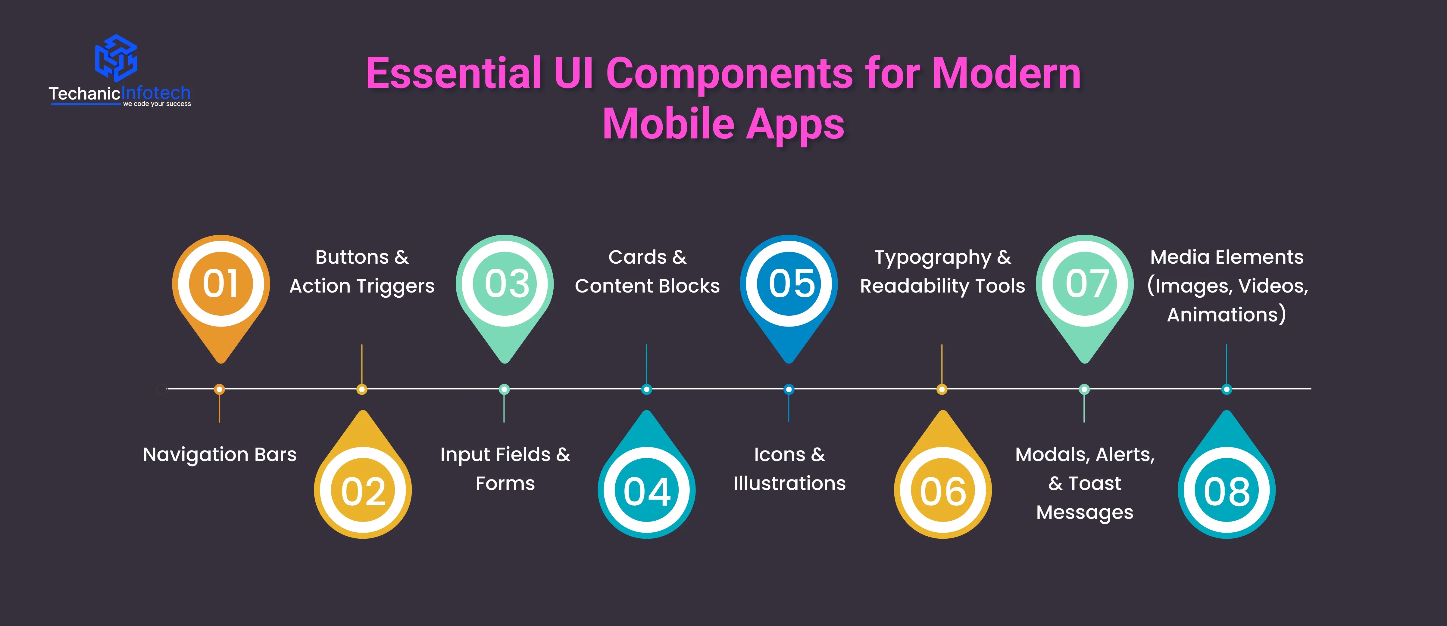
Navigation bars help users move around the app easily. If it’s a bottom navigation bar, hamburger menu, or tab bar, it must be simple and clear.
Good navigation reduces confusion and helps users explore the app without effort. In modern mobile app interface design, intuitive navigation is considered a must-have because it directly impacts usability and retention.
Buttons guide users toward important actions, signing up, submitting forms, purchasing items, or moving to the next screen.
Effective buttons are easy to tap, visually distinct, and clearly labeled. Designers also use floating action buttons (FABs) for quick access to key functions. When designing mobile apps, action triggers must always remain visible and thumb-friendly.
Forms allow users to enter information such as login details, searches, or preferences. Clean, simple input fields reduce frustration and improve onboarding.
Auto-fill, validation messages, and helpful placeholders make the process smoother. Good input design plays a major role in both usability and conversion.
Card layouts help organize information into neat, readable sections. They are widely used in dashboards, product listings, news feeds, and social apps.
Cards help users scan content quickly while keeping the UI visually appealing. This makes them a popular element in modern mobile app UI design across industries.
Icons simplify communication by replacing long text with familiar visuals.
Well-designed icon sets improve navigation and make the app look polished. Illustrations, when used carefully, add personality to the app and make the experience more engaging. These visual elements also support brand identity and help your app stand out.
Readable text is one of the most important parts of any mobile app design guide.
Clear font choices, proper sizes, and good contrast ensure that users can read comfortably on small screens. Using hierarchy, bold headlines, medium subheads, and normal body text, guides the eye and improves overall flow.
These components notify users about updates, warnings, or confirmations. Alerts must be clear and quick to understand, while toast messages show temporary feedback without interrupting the user’s flow. Proper use of alerts improves the app’s communication style and enhances the user journey.
Modern apps rely heavily on visuals to improve engagement.
Smooth animations make transitions feel natural, while high-quality images and videos enhance the storytelling aspect of your app. When used wisely, these elements make the app feel modern and enjoyable without affecting performance.
A great app isn’t just about how it looks, it's about how it feels to use. Strong UX (User Experience) design ensures your app is easy, fast, and enjoyable for every user.
In any mobile app design guide, UX is considered the backbone of the entire product. When done right, UX reduces confusion, improves engagement, and helps users complete tasks without friction.
Here are the best UX practices to follow when designing mobile apps for modern users.
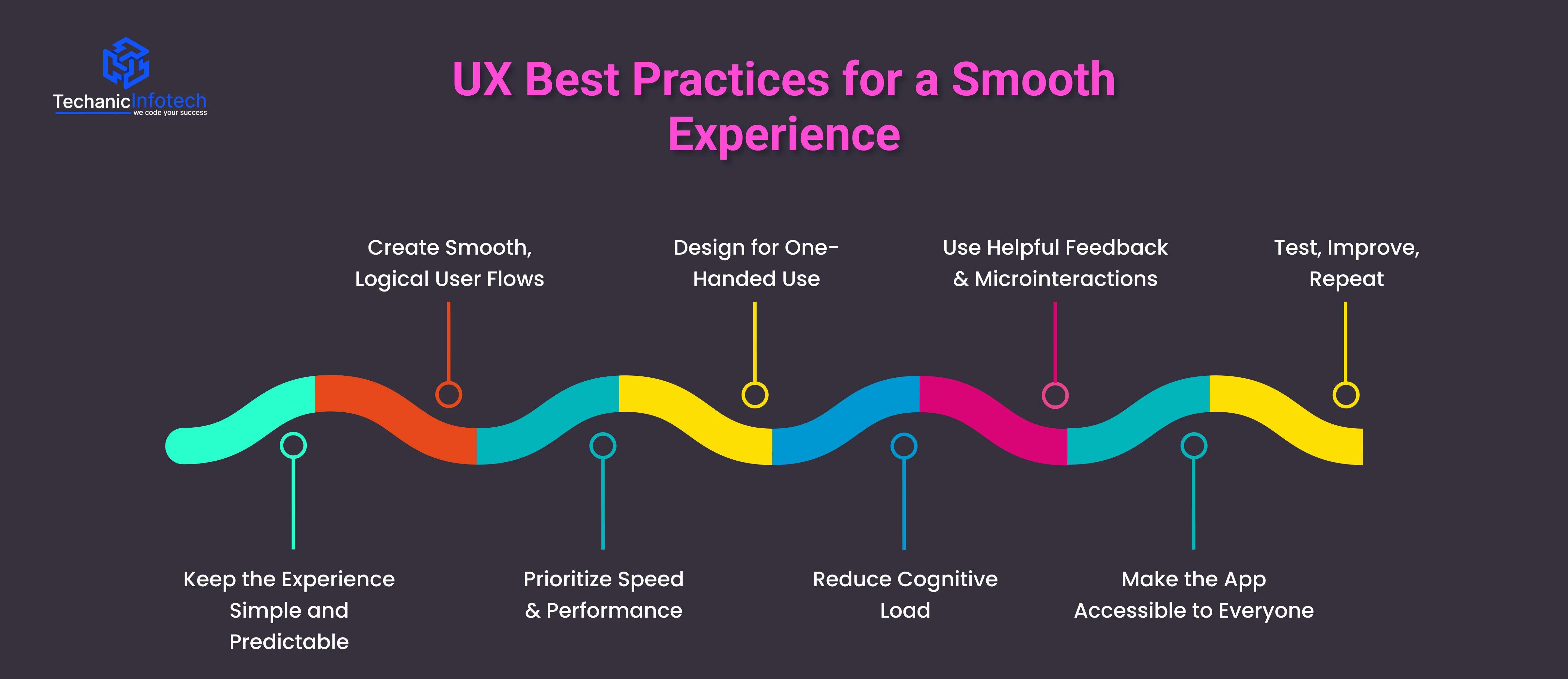
Users love apps that feel effortless. A clean layout, clear buttons, and straightforward journeys help users instantly understand how the app works.
Avoid unnecessary complexity, too many pop-ups, long forms, or hidden features make users leave quickly. Predictable behavior ensures that every action leads to exactly what the user expects, which is essential in modern mobile app UI/UX design.
A good UX flow guides users from start to finish without confusion. Whether they’re signing up, ordering a service, or completing a purchase, each step should feel natural.
When designing mobile apps, avoid forcing users through long paths or hidden screens. Map out user journeys clearly so actions take only a few steps.
Slow screens ruin the entire experience. Fast loading times, smooth transitions, and responsive interactions are must-haves in mobile app interface design.
Optimize images, reduce heavy animations, and keep code clean to ensure your app performs well,, even on low-end devices. Performance is a direct part of good UX.
Most users operate their phones with one hand or thumb. Placing buttons, menus, and navigation controls within easy reach makes the app more comfortable to use.
Thumb-friendly zones are a major best practice in the latest mobile app UI/UX design trends.
Cognitive load refers to how much mental effort a user needs to understand something. Keep text short, use familiar icons, group information, and avoid long forms.
Breaking tasks into smaller steps improves focus and reduces frustration. In short, make users think less and do more.
Good UX always communicates. Buttons should respond instantly, forms should show error messages clearly, and actions like uploading or saving should have progress indicators. Microinteractions, small animations or feedback responses, make the app feel alive and more engaging.
Accessibility is no longer optional. Use readable fonts, proper color contrast, larger touch targets, and screen-reader friendly layouts. These changes make your app usable for people with visual, hearing, or motor challenges. An accessible app reaches more users and ranks better.
UX design doesn't end at launch. Keep testing real user behavior, run usability tests, study analytics, and make updates regularly. Continuous refinement is a core part of any mobile app design guide.
Both iOS and Android follow different design systems, layout rules, and user expectations. Understanding these differences helps you create a smooth and consistent user experience across both platforms.
|
Design Aspect |
iOS Design (Apple) |
Android Design (Google) |
|
Design Guidelines |
Uses Human Interface Guidelines (HIG), focusing on clarity, depth, and subtle motion. |
Uses Material Design Guidelines, focusing on bold colors, shadow layers, and meaningful motion. |
|
Navigation Patterns |
Bottom navigation bars and tab bars are widely used. No hamburger menus for primary actions. |
Uses bottom navigation, navigation drawer (hamburger menu), and top tabs. Offers more flexibility. |
|
Back Navigation Behavior |
Users rely on the top-left back button or swipe gestures. |
Uses the system back button and in-app back actions. Consistent across apps. |
|
Typography |
Default font: San Francisco (SF Pro). Clean, compact, and highly readable. |
Default font: Roboto. Designed for digital clarity and universal readability. |
|
Icon Style |
Minimal, thin, rounded icons with a clean aesthetic. |
Uses filled, bold, geometric icons. More variety in icon libraries. |
|
Button Styles |
Mostly uses text buttons, rounded rectangles, and clear minimal styles. |
Uses elevated (raised) buttons, outlined buttons, and FAB (Floating Action Button). |
|
Screen Layout |
Uses safe areas to avoid notches and interactive edges. More spacing and white space. |
Uses constraint layouts with adaptive grids. More flexibility for screen variation. |
|
Gestures |
Heavy use of gestures: swipe-to-go-back, pull-to-refresh, drag interactions. |
Gestures exist but users rely more on visible buttons and system navigation. |
|
Alerts & Modals |
Uses centered pop-ups and sheet-style alerts. Clean and small. |
Uses full-width dialogs, bottom sheets, and snackbars for feedback. |
|
App Bar / Header |
Uses a bold title at the top with minimal actions. |
Uses a larger toolbar/app bar with action icons and menu buttons. |
|
Floating Action Button (FAB) |
Not commonly used in iOS design. |
A core part of Material Design. FAB is used for primary actions. |
|
Device Fragmentation |
Limited screen sizes: easier to optimize. |
Huge variety of screen sizes: requires adaptive and responsive layouts. |
|
Animation Style |
Soft, smooth, subtle animations. |
Bold, dynamic, physics-based motion. |
|
Developer Constraints |
Stricter design rules and consistency requirements. |
More freedom with layouts, navigation, and UI structure. |
|
User Expectations |
Clean, minimal, premium feel with smooth transitions. |
More customization, personalization, and visible controls. |
Choosing the right tools is an important part of any mobile app design guide. These tools help designers plan layouts, create UI elements, test interactions, and collaborate with teams.
If you are working on your first project or designing mobile apps professionally, using the right design tools makes the entire process faster, smoother, and more creative. Below are the most popular tools used in modern mobile app UI/UX design.
Figma is one of the most widely used tools for designing mobile apps. It works directly in the browser, allowing teams to collaborate in real time. Designers can create UI screens, build prototypes, share links, and collect feedback instantly.
Its powerful components, auto-layout system, and responsive design features make it ideal for creating modern mobile app interface design. Figma is beginner-friendly and perfect for both small and large teams.
Sketch is a popular design tool for Mac users. Known for its simplicity and clean interface, it allows designers to create high-quality UI screens quickly.
It also supports plugins that help with animation, workflow automation, and design system management. While it doesn’t offer real-time collaboration like Figma, Sketch remains a strong choice in many professional mobile app UI/UX design workflows.
Adobe XD is a powerful tool for designing and prototyping mobile apps. It allows designers to create screens, add interactions, and preview the full user journey.
XD supports vector editing, voice interactions, micro-animations, and responsive design features. It’s often recommended for beginners because the interface is simple and easy to learn. XD is widely used in mobile app design guides for prototyping and testing ideas.
InVision is primarily used for prototyping and design collaboration. You can upload screens from Figma or Sketch and turn them into clickable prototypes.
It also offers features like workflow tracking, feedback tools, and design handoff for developers. InVision is useful when you want to test user flows or share your design system with stakeholders.
Beyond the main design tools, apps like Zeplin, Marvel, Miro, and Notion help with documentation, wireframing, and smooth developer handoff.
These tools make project management easier and ensure that design and development teams stay aligned from start to finish.
The world of mobile app design evolves quickly, and staying updated with the latest trends is essential for building modern, engaging apps.
If you are following a mobile app design guide, these trends help you create fresh, intuitive, and future-ready experiences.
Below are the most popular trends shaping mobile app UI/UX design today.
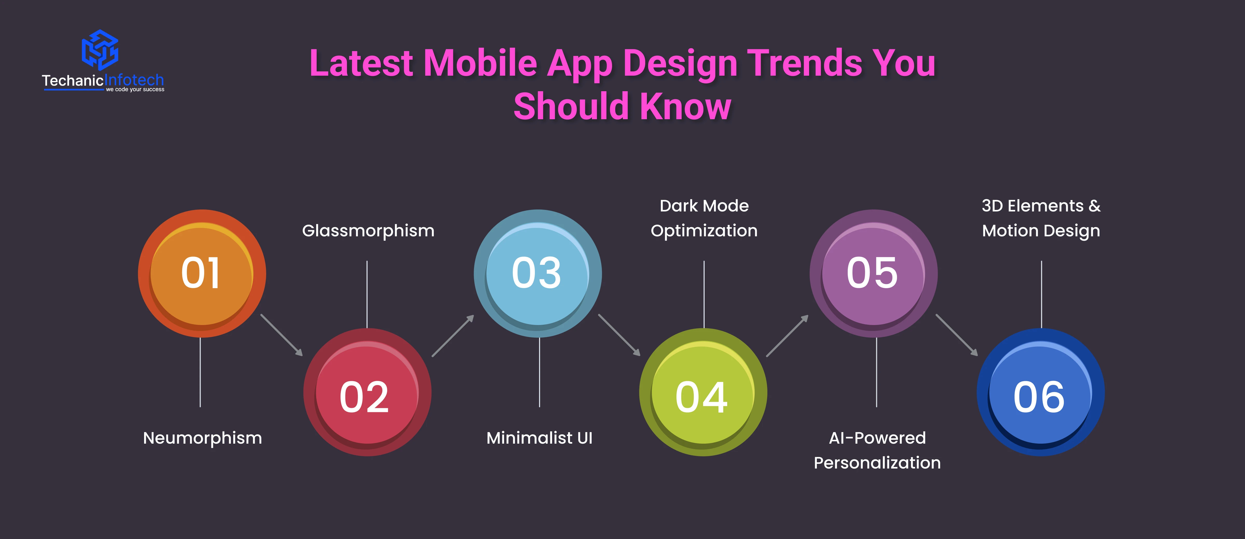
Neumorphism blends flat design and skeuomorphism to create soft, realistic UI elements that look almost touchable.
It uses shadows and highlights to give buttons and cards a subtle 3D look. This trend brings a clean, modern feel to mobile app interface design, making apps appear smooth and minimal while still visually appealing
Glassmorphism creates a frosted-glass effect using transparency, blur, and layered backgrounds. It makes interfaces feel light, elegant, and futuristic.
Many modern apps use it for cards, pop-ups, and dashboards. In mobile app UI/UX design, glassmorphism adds depth and enhances the overall aesthetic without overwhelming users.
Minimalism remains one of the strongest design trends. It focuses on simplicity, clean layouts, ample spacing, and only essential elements.
A minimalist approach reduces distractions and improves usability, which is a core rule in every mobile app design guide. This trend works especially well for apps that require fast decision-making and intuitive navigation.
Dark mode is no longer optional. Users expect apps to support it for better comfort, battery savings, and aesthetic appeal.
Designers now create dedicated dark UI palettes instead of simply inverting colors. Designing mobile apps with proper contrast, readability, and accessibility ensures a polished dark-mode experience.
AI is transforming how apps behave. Apps now analyze user behavior, preferences, and patterns to offer personalized content, suggestions, and experiences.
AI-driven design makes interfaces feel smarter and more relevant. It also improves user engagement, making it a key trend in mobile app UI/UX design.
3D icons, illustrations, and animations bring apps to life.
Combined with smooth micro-interactions and motion effects, they make the experience more immersive. This trend enhances storytelling and improves user engagement when used thoughtfully.
Designing a mobile app is not just about choosing colors or placing buttons. Even the smallest mistake can ruin the experience and push users away. That’s why every mobile app design guide highlights the importance of avoiding common UX and UI errors.
When designing mobile apps, keeping these mistakes in mind will help you build smooth, user-friendly, and visually appealing experiences.
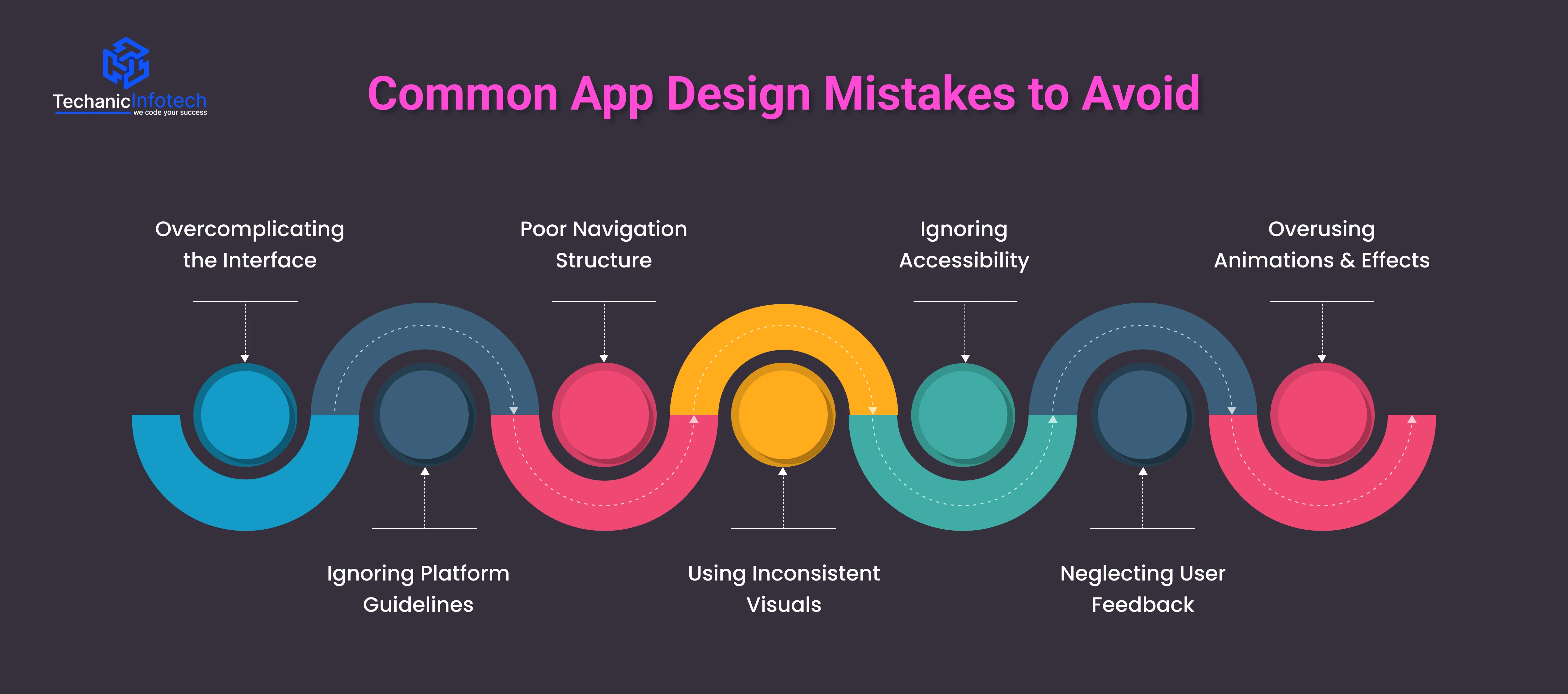
A cluttered screen confuses users. Too many icons, long text blocks, or unnecessary options make it hard for people to understand what to do. A simple layout improves clarity and keeps users engaged.
iOS and Android have different rules for navigation, spacing, and layout. Ignoring these guidelines creates an inconsistent experience. Following platform standards makes your mobile app interface design feel natural and predictable.
If users cannot find features quickly, they leave. Hidden menus, unclear labels, or too many steps to complete simple actions are major design flaws. Clear, intuitive navigation is essential in mobile app UI/UX design.
Inconsistent fonts, colors, button styles, and icon shapes make the app feel unprofessional. Consistency builds trust and reduces cognitive load, helping users interact with your app comfortably.
Many apps still overlook accessibility features such as larger text, proper contrast, and readable fonts. A good app should be usable by everyone, including users with disabilities. Accessibility improves both user satisfaction and retention.
Designers sometimes make decisions based on assumptions instead of actual user behavior. Not testing your design or ignoring user feedback often leads to confusing experiences. Continuous testing and improvements are key parts of any mobile app design guide.
Animations look great, but too many slow the app down. Heavy visuals affect performance and distract users from the main purpose of the app. Always balance style with usability.
The cost of mobile app design depends on several factors, including complexity, number of screens, platform (iOS or Android), custom graphics, and the overall UI/UX requirements. In most cases, design pricing is calculated based on hours, skill level, and project scope.
For a basic app with simple layouts, the design cost is lower because it involves fewer screens and minimal custom elements. However, advanced apps, like eCommerce, fitness, education, or social platforms, require detailed user journeys, animations, prototypes, and multiple iterations. This increases both mobile app development cost and time.
On average, designing mobile apps can range from $5,000 to $20,000, depending on how detailed the interface is. Apps that require features like AI-driven personalization, custom illustrations, complex dashboards, or unique animations will naturally cost more.
The platform also affects pricing. Designing for both iOS and Android takes more effort because each follows different UI rules. This is why many mobile app design guide experts recommend finalizing a design system early to save cost and maintain consistency.
Investing in professional mobile app UI/UX design is crucial because good design improves user retention, engagement, and conversions. Ultimately, the cost of design is not an expense, it’s an investment in creating an app that feels modern, intuitive, and competitive in today’s market.
Investing in professional mobile app UI/UX design is crucial because good design improves user retention, engagement, and conversions. Ultimately, the cost of design is not an expense, it’s an investment in creating an app that feels modern, intuitive, and competitive in today’s market.
At Techanic Infotech, we don’t just design apps, we create digital experiences. As a trusted mobile app development company, our team follows a research-driven and user-centered approach to build designs that are clean, intuitive, and conversion-focused. Whether you're launching a startup app or redesigning an enterprise platform, our designers ensure every screen is visually appealing, easy to use, and aligned with your brand.
With Techanic Infotech, you get app designs that not only look great but also perform smoothly in real-world use. If you want an app interface that users love and businesses trust, we’re here to help bring your idea to life.
A well-designed mobile app is more than good visuals, it’s a complete experience built around clarity, usability, and user needs.
This mobile app design guide walked you through the principles, steps, tools, and best practices that shape modern UI/UX. Whether you’re building a simple app or a complex platform, focusing on clean navigation, intuitive layouts, and consistent design helps you deliver an app users love.
Strong design not only improves engagement but also increases retention and long-term success. With the right approach, your app can stand out in today’s competitive digital world.
The first step in mobile app design is understanding your users, their needs, goals, challenges, and behavior. This helps you create a user-centric layout that feels natural and easy to navigate.
Mobile app design can take 2 to 8 weeks, depending on the number of screens, complexity, and required iterations. Apps with custom illustrations, animations, or advanced flows take longer.
Popular tools include Figma, Adobe XD, Sketch, and InVision. These tools help with wireframes, UI design, prototyping, and collaboration throughout the design process.
Mobile app design usually costs $2,000 to $20,000, depending on the complexity of the UI, number of screens, platform (iOS/Android), and design details like animations or custom graphics.
A good app design is simple, intuitive, visually consistent, and accessible. It guides users smoothly through the journey and supports fast performance with clean UI/UX.

Bharat Sharma is the CTO of Techanic Infotech, bringing deep technical expertise in software architecture, mobile app development, and scalable system design. He leads the engineering team with a strong focus on innovation, performance, and security.